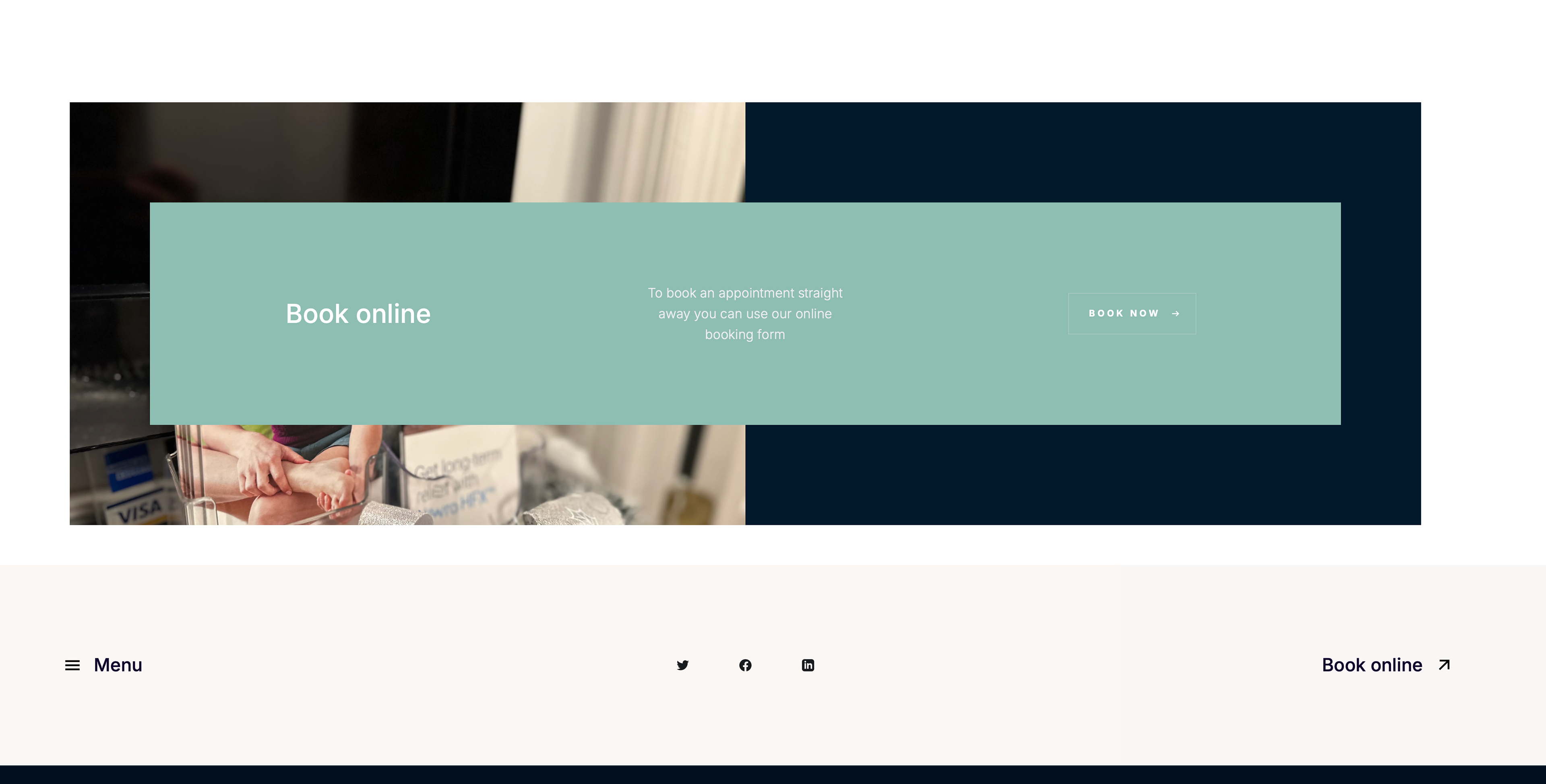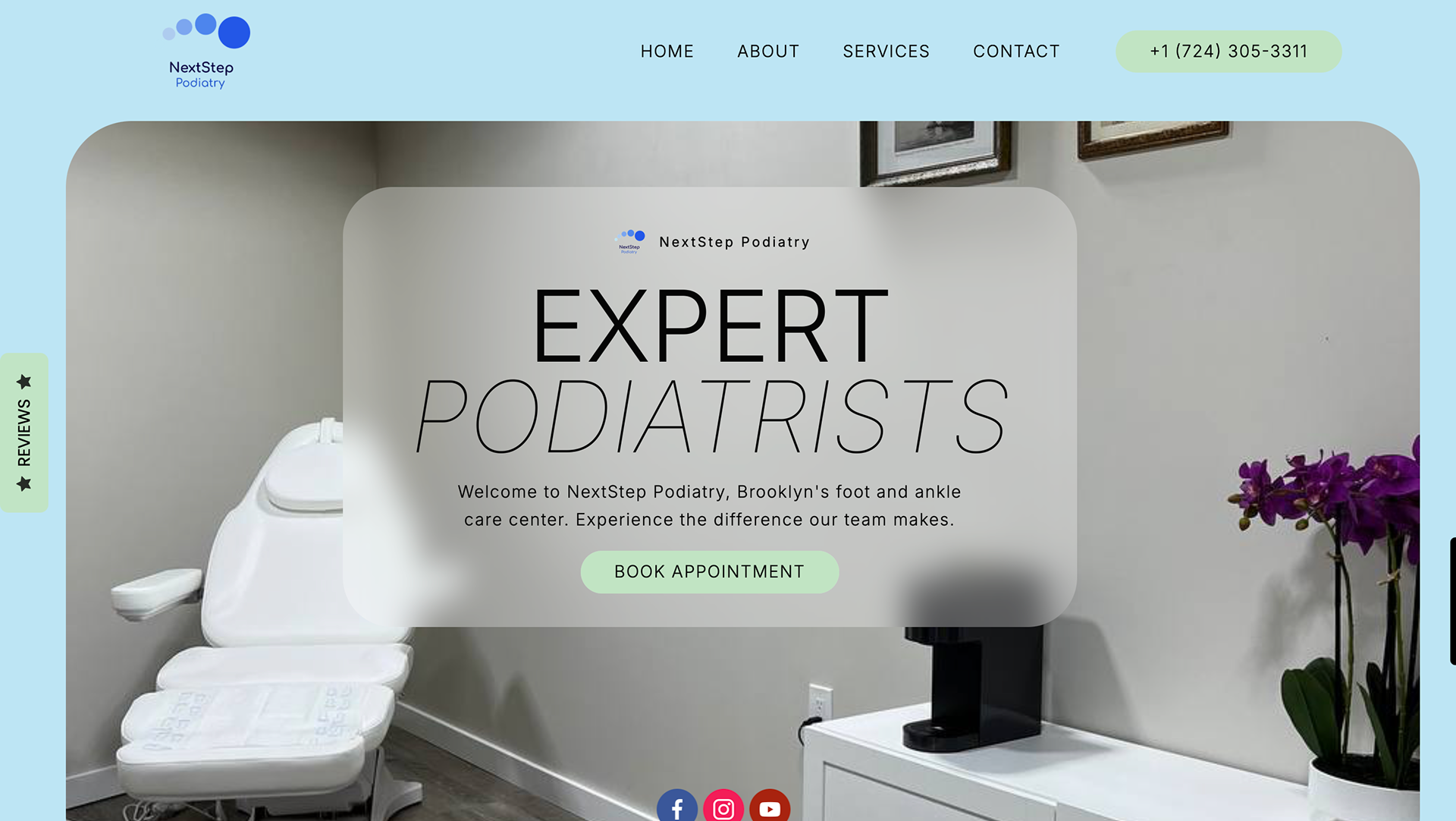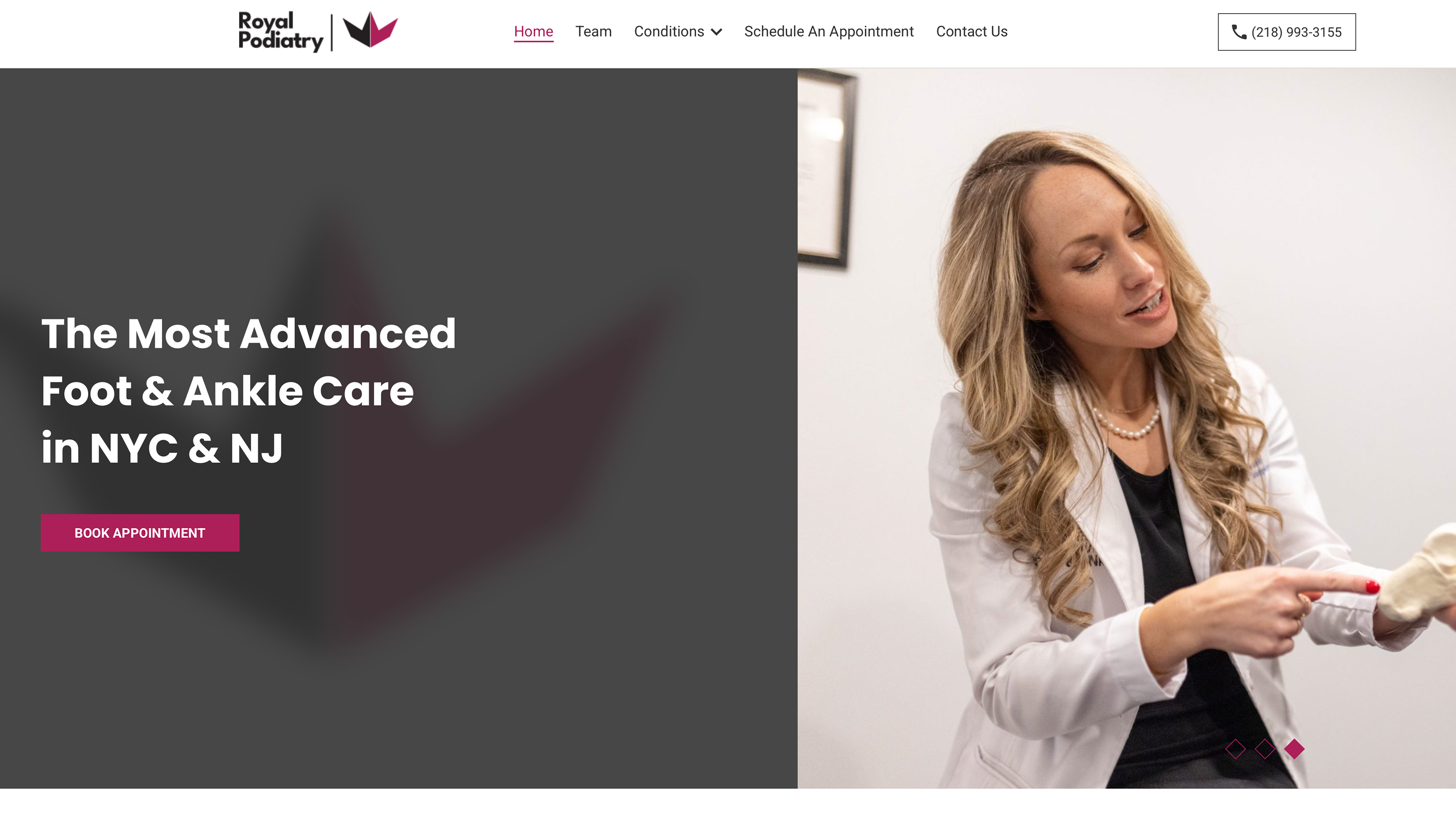
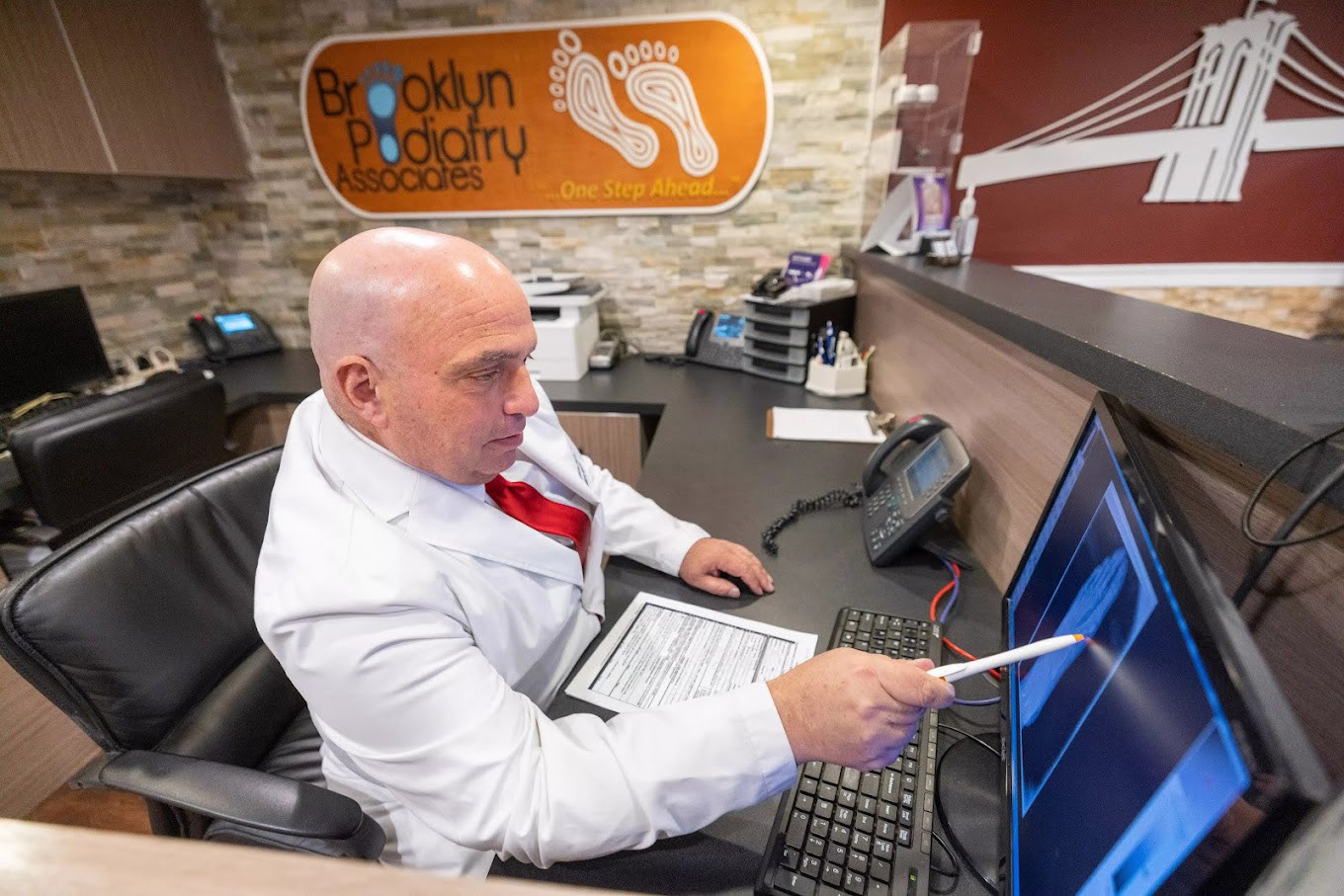
Client challenge:
- The website was outdated and no longer felt modern.
- The user experience was not intuitive or easy to navigate.
- Patients could not immediately understand whether the clinic was currently active. The existing visual identity relied heavily on white and a very strong blue, which created an unpleasant and unbalanced impression.
Design goals:
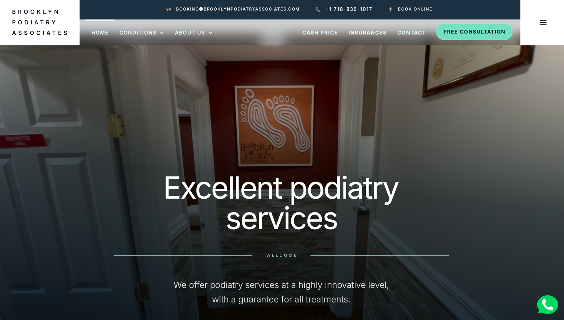
- Refresh the website to feel current and professional.
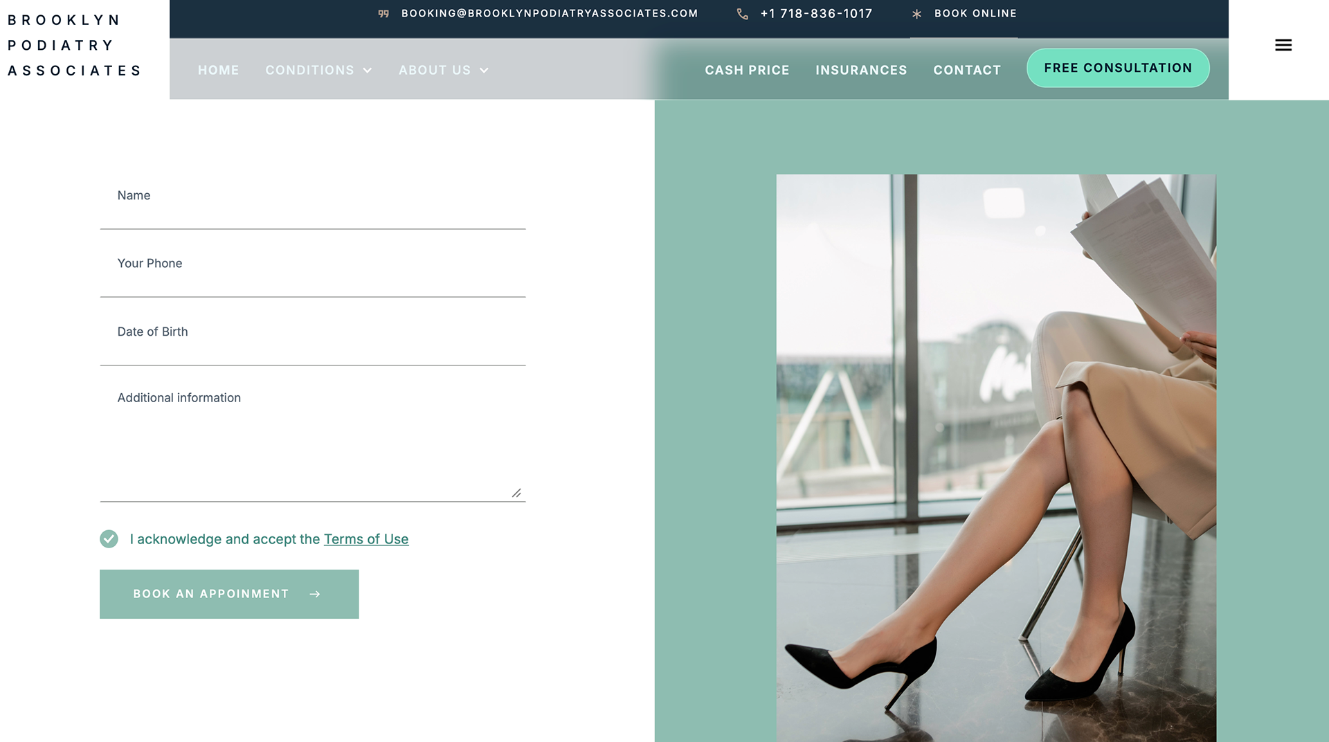
- Improve usability and make information easier to find.
- Create a clearer visual hierarchy for patients.
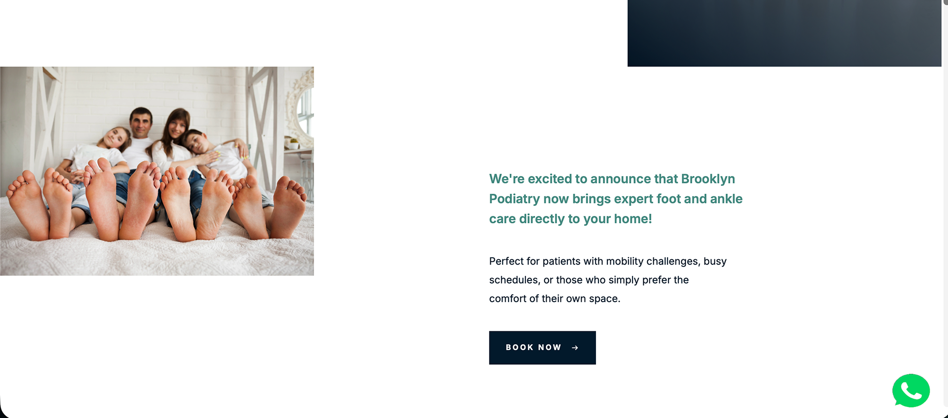
- Present the clinic as active, trustworthy, and welcoming.
- Soften the visual language while keeping a medical and credible look.
Solution:
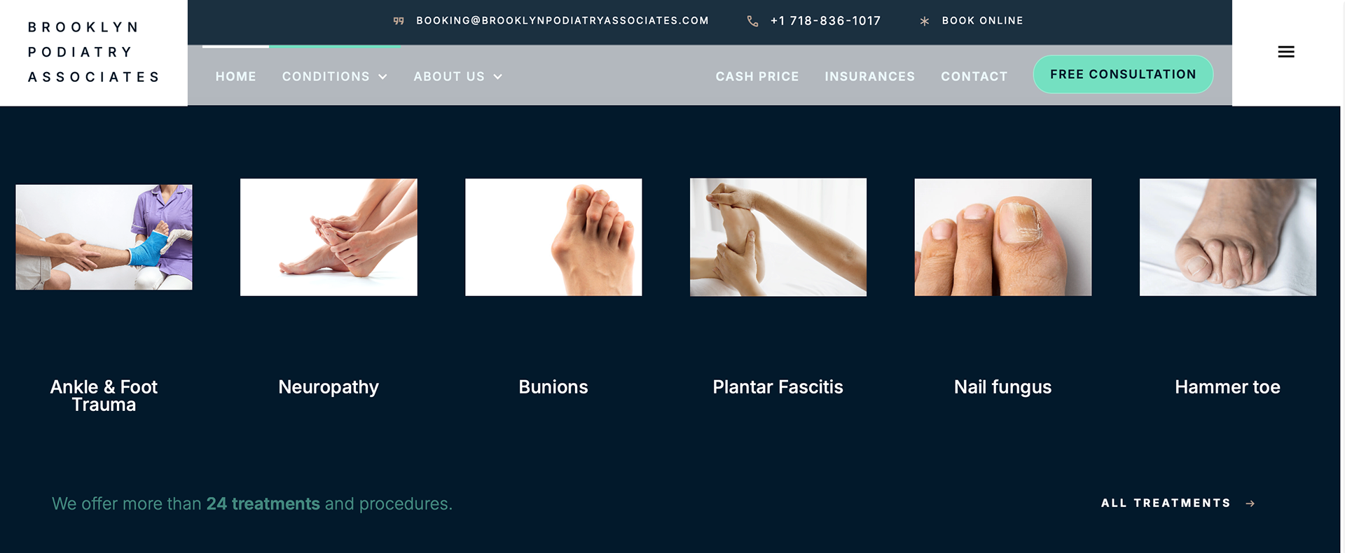
- The website structure was reorganized for better clarity and navigation.
- Visual hierarchy was improved to guide users through the content more naturally.
- The color approach was adjusted to feel cleaner, more balanced, and more refined.
- The overall design was updated to support trust and make the brand feel more approachable.
Result:
- A more modern and user-friendly website.
- Better communication of the clinic’s active status.
- A more professional and reassuring digital presence.
- Improved clarity for patients exploring services and contact information.